Natural Choice Landscaping
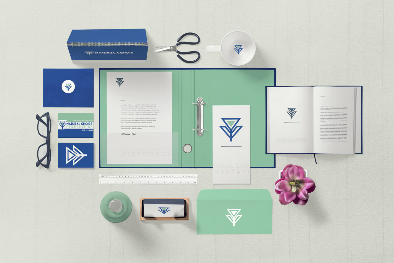
Natural Choice Landscaping came to us looking for a logo to stand out from the sea of green and brown landscape design logos that have flooded Arizona over the last twenty or so years. Natural Choice isn’t just a traditional landscaper – sure they will mow your lawn or clean up the hedges – however, they excel at beautiful landscape designs with a focus on hardscaping. When we saw their mastery over masonry, we knew we had to give them something as beautifully geometric as the designs they provide their clients.
We decided to go with a geometric font and modified it with triangle accents to match the heart of the flower icon of their logo. The colors in Natural Choice’s logo were carefully crafted to ensure that they were unique from the other landscape companies in Arizona. Most landscaping companies opt for greens and browns in order to give off an Earthy, nature-oriented feeling to their clients. Natural Choice wanted to break the mold and give off clean, trustworthy vibes that mint and royal blue tones can elicit.
The shape of the logo mark was inspired by a little flower that was sent to us by the owner of Natural Choice during the discovery phase of the logo project. Since they are masters of geometric masonry and rock work, we wanted to bring about that same feeling in their logo by forcing the beauty of nature into a simple geometric form.